A choropleth map of home prices in Beijing.
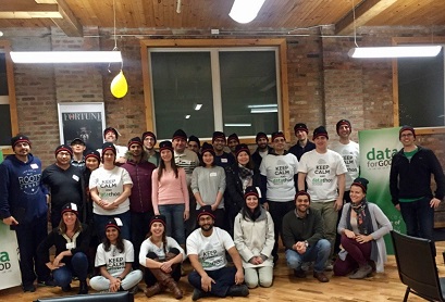
Data for Good teaming up with Raising the Roof held a DataThon on Saturday in Toronto. I was glad to take part in it. It was 12-hour data crunching on about 20 data sets. In this post, we'll deal with one of them -- a donation Excel file. We're going to explore and clean it, create a new feature, and finally do donation frequency analysis.
SAS has taken another step to embrace open source by bringing SAS and Jupyter Notebook together. SAS coding in Jupyter Notebook is available in April for SAS Linux, and in July for SAS University Edition. I'll use Jupyter notebooks to compare the output of Kaplan-Meier (KM) survival estimatation using SAS and Python.
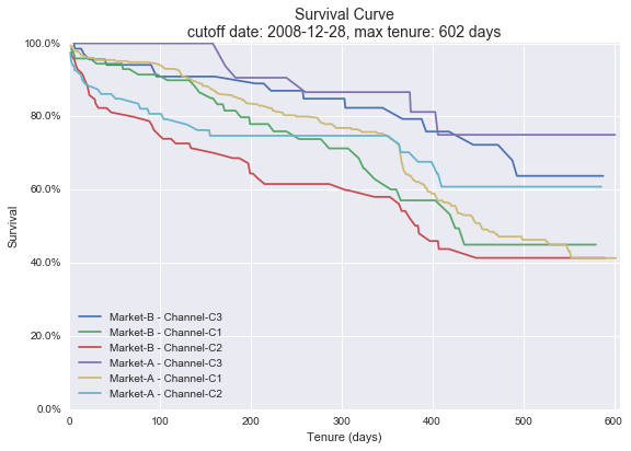
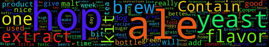
Business never stands still, and neither does business data. Every data set is just a snapshot of a business. Each feature in data has a time frame before a snapshot date. Even within a time frame, some data still has temporal dynamics. We'll detail this point using three examples. The first is about historical prices of stock market; the third introduces a paper which shows a subtle temporal nature in beer reviews. The two are described briefly. The second is about the effect of cutoff dates on the target feature in survival analysis.
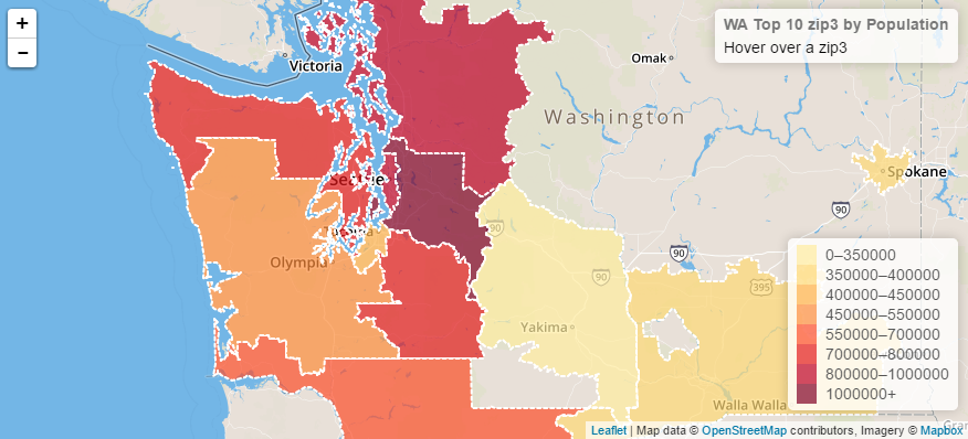
In this post, we'll load a large GeoJSON file into MongoDB by ijson (a Python package). Then we'll answer two questions using MongoDB aggregation pipelines; SQL queries are also given for comparisions. We'll wrap up with visualizing querying results on a map.